About
Projects
Services
Contact


Projects

Evoleum
Redesigning a cosmetic website more friendly user
Timeline
Mar- May 2024
Plateform
website
Industry
Beauty
My Role
UX/UI designer
Intro
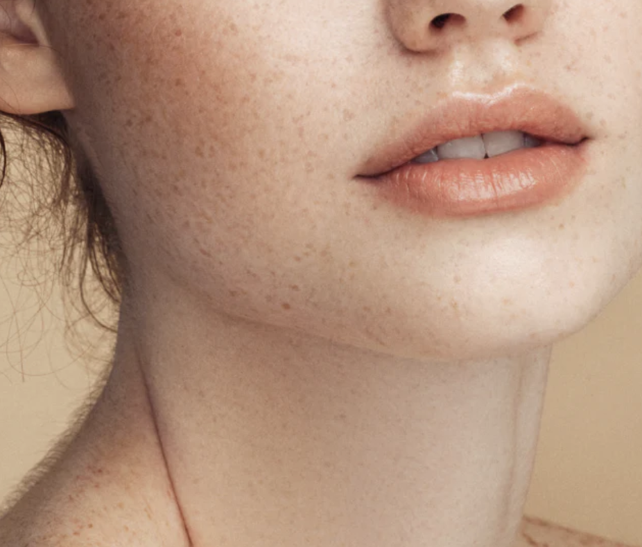
Evoleum is a French skincare brand known for its science-backed, luxury products. They needed a modern website that reflected their premium identity and offered a smoother user experience.
pROBLEM
The original website was cluttered and hard to navigate. Inconsistent branding and poor structure made it difficult for users to find key products, causing confusion and drop-offs.
goal
The goal was to redesign the site to improve clarity, simplify navigation, and create a clean, elegant layout that matched Evoleum’s high-end image.
my role
As the UX/UI designer, I led the audit and redesign. I conducted heuristic analysis and competitor research, then restructured the navigation, layout, and visuals to improve usability and align with the brand.
Projects


Intro
Evoleum is a French skincare brand known for its science-backed, luxury products. They needed a modern website that reflected their premium identity and offered a smoother user experience.
pROBLEM
The original website was cluttered and hard to navigate. Inconsistent branding and poor structure made it difficult for users to find key products, causing confusion and drop-offs.
goal
The goal was to redesign the site to improve clarity, simplify navigation, and create a clean, elegant layout that matched Evoleum’s high-end image.
my role
As the UX/UI designer, I led the audit and redesign. I conducted heuristic analysis and competitor research, then restructured the navigation, layout, and visuals to improve usability and align with the brand.

Timeline
March 2024 - May 2024
Plateform
website
Industry
Beauty
My Role
UX/UI designer
Evoleum
Redesigning a cosmetic website more friendly user
The color palette was carefully selected to evoke trust, sophistication, and a sense of calm, aligning with the brand’s identity while enhancing the overall visual appeal
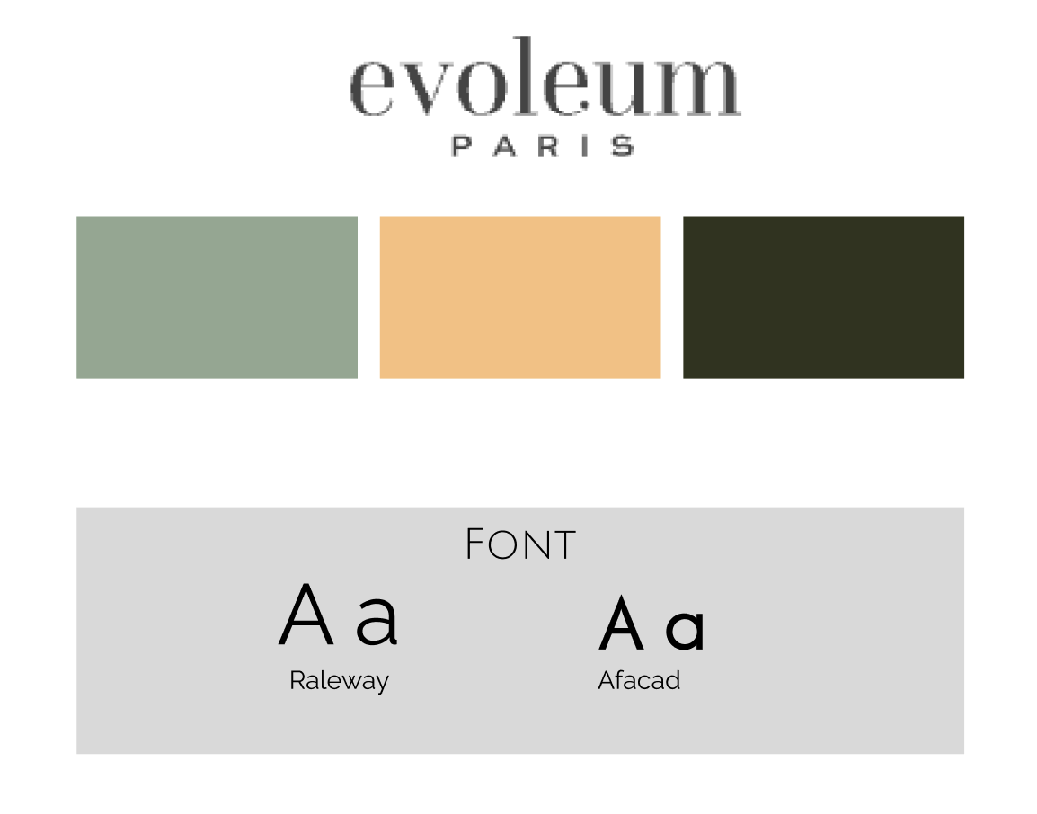
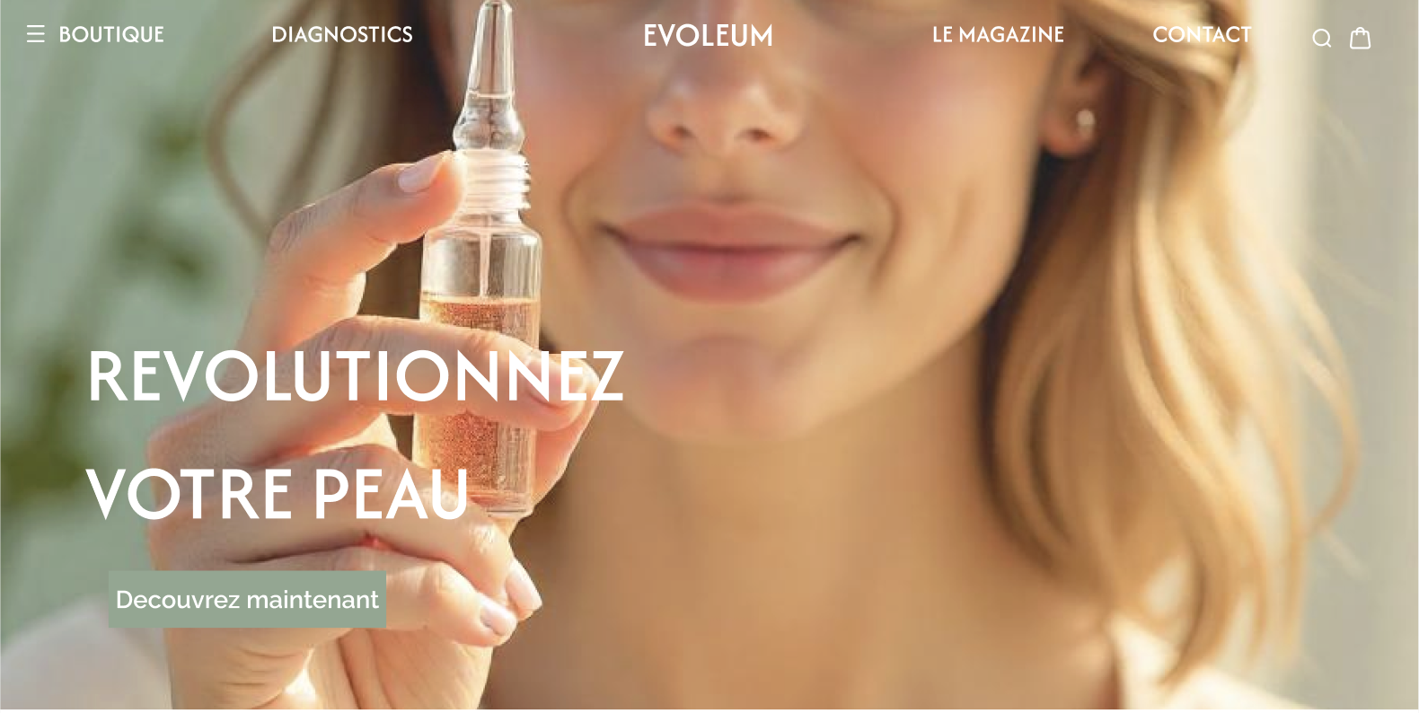
I redesigned the header to look cleaner and more consistent. I chose soft, elegant colors that match the brand and make the site feel calm and professional. This helped create a smoother and more pleasant experience for users.
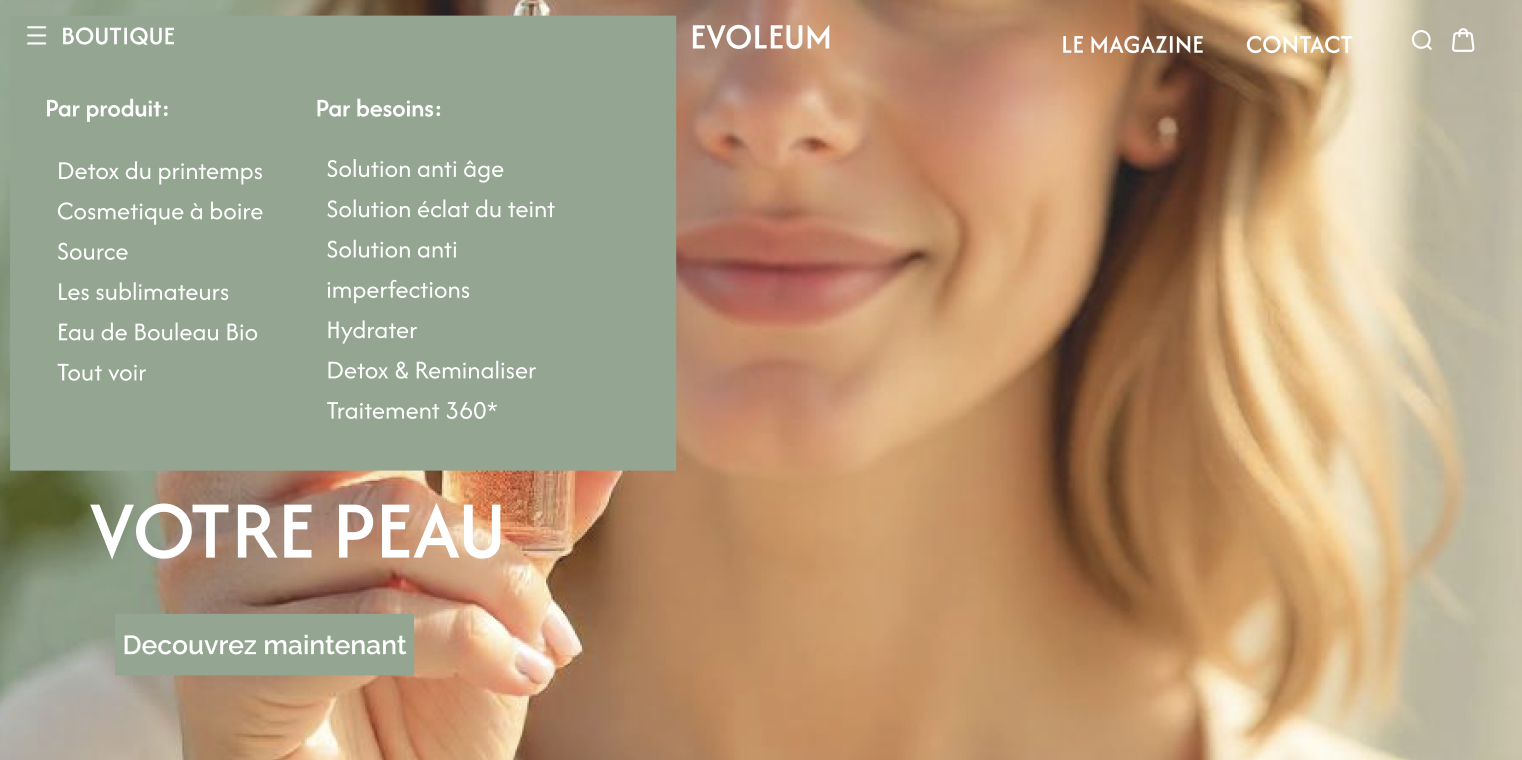
Simplifying the Maze
The old navigation was a puzzle. I combined the "Shop" and "Needs" categories into one, with a dropdown menu that lets users easily shop based on the brand's offerings or their specific needs. Now, users can directly access solutions for dryness or acne, in just one click. This made the navigation cleaner and easier to use.
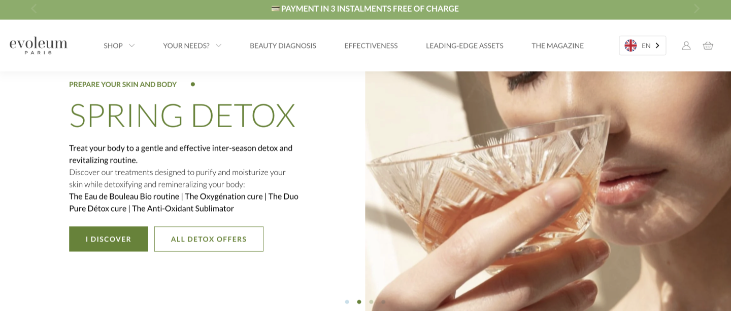
I knew simplification was key.
How I Tackled the Redesign?
I looked closely at Evoleum’s website to find what wasn’t working. The menu had too many options, and important products were hard to find. Users had to click several times to get to what they needed. The site felt messy and confusing. The navigation bar alone had 6 categories, 2 of which had dropdown menus containing 14 different options. Also, key items were buried three clicks deep.

Lesson learned
This project reminded me that good design isn’t about adding more, it’s about removing what’s not needed. At first, I thought more menus and buttons would help. But I realized they just created confusion. By cutting extra sections, combining menus, and giving bestsellers their own space, the site became simpler and more effective.
The impact
Before, the website was messy and hard to use. Now it’s clean and organized. I reduced the menu from over 14 options to just a few. Bestsellers are easy to find, and the shop section is clear and focused.
The new colors match the brand and feel more modern. It’s too early for data, but a simpler site means less stress for users and a better chance they’ll take action.
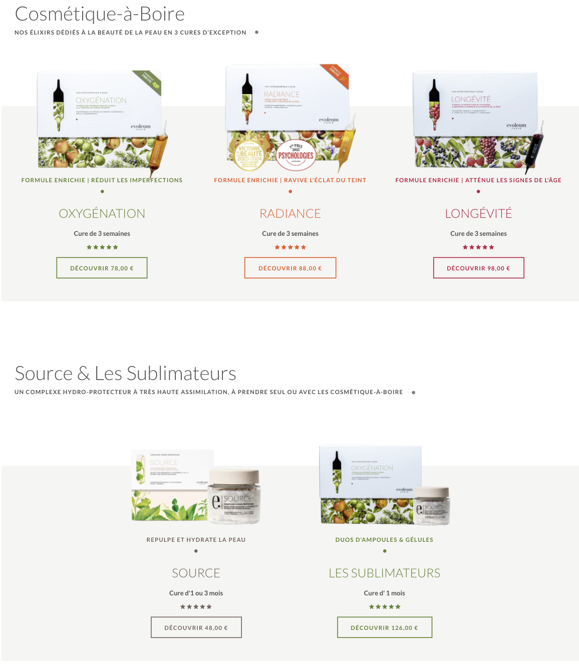
I reorganized the shop section into one clear area to show the products better. I added a simple headline and fewer buttons to keep it clean. I also moved the Beauty Diagnostic and reviews to appear before the shop. This made the page easier to follow and helped users focus on the products.
Redesigning Evoleum felt like helping a friend declutter her closet. We kept the timeless pieces, donated the rest, and made everything effortlessly findable.
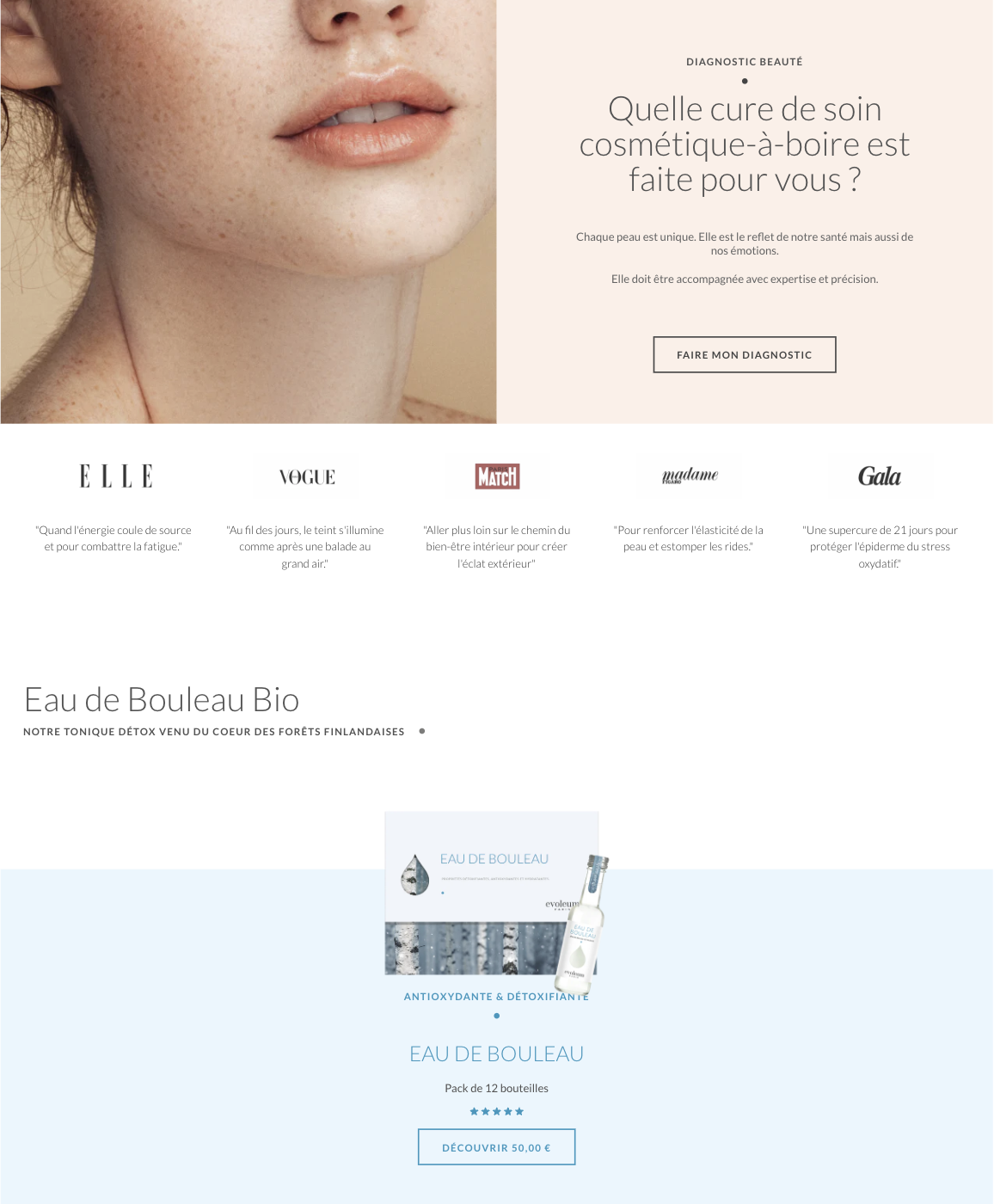
AFTER
Diagnostic beauté
Formulées avec du collagène, des vitamines et des antioxydants, ces ampoules agissent de l’intérieur. Assimilés dès l’ingestion, leurs actifs nourrissent la peau et boostent son éclat. En renforçant l’hydratation et la barrière cutanée, elles révèlent un teint immédiatement lumineux et durablement sain.
BUVEZ. ABSORBEZ. RAYONER.
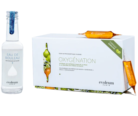
EAU DE BOULEAU & OXYGÉNATION
Antioxydante & Détoxifiante
48

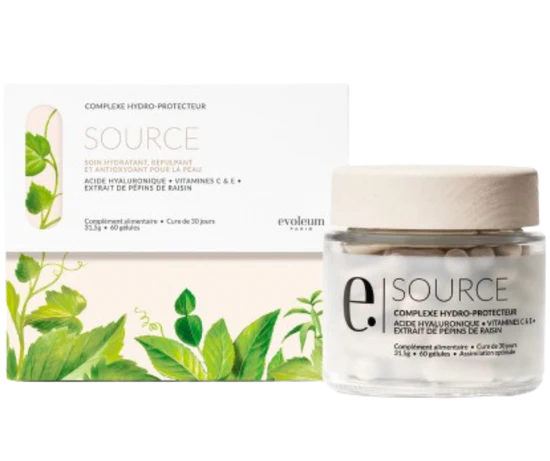
SOURCE
Repulpe et hydrate la peau
48
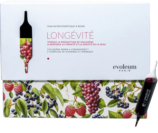
LONGÉVITÉ
Attenue les signes de l’âge
95
Découvrez nos solutions pour une peau éclatante, avec des soins qui agissent de l'intérieur
NOTRE SELECTION
QUI SOMMES NOUS?
Chez evoleum, nous sommes convaincus que toutes les femmes ont en elles un trésor invisible d’énergie et de puissance. Il est la condition de l’équilibre qui les rend belles.Pour le préserver et le nourrir, nous avons travaillé en synergie avec des experts de la santé, de la nutrition et de la cosmétique. Le résultat : des gammes d’exception qui offrent chacune un concentré nutritif certifié pour son efficacité.Nos cures sont naturelles, bonnes et belles pour que chaque jour, les femmes prennent soin d’elles.
Notre histoire
BEFORE
The shop section was too long and messy. It took up almost two full pages and was hard to follow. Other sections, like the Beauty Diagnostic and reviews, were placed between products, which made it even more confusing. Too many buttons made users lose focus and forget what they were looking for.
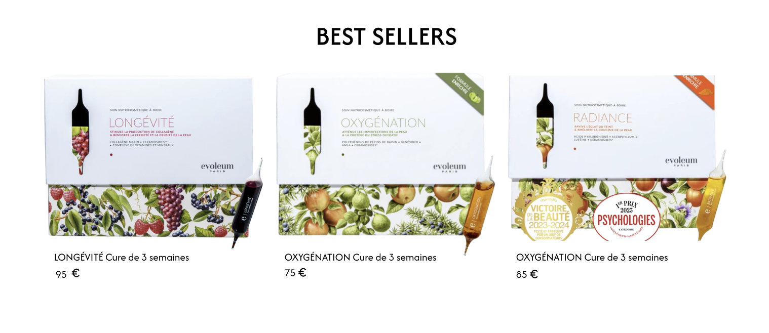
Important products weren’t easy to spot. I added a clear Best Seller section to highlight the most popular items. This helps users quickly see what others love and makes it easier to find top products.
Highlighting What Matters
About
Projects
Services
Contact
Lesson learned
This project reminded me that good design isn’t about adding more, it’s about removing what’s not needed. At first, I thought more menus and buttons would help. But I realized they just created confusion. By cutting extra sections, combining menus, and giving bestsellers their own space, the site became simpler and more effective.
The impact
Before, the website was messy and hard to use. Now it’s clean and organized. I reduced the menu from over 14 options to just a few. Bestsellers are easy to find, and the shop section is clear and focused.
The new colors match the brand and feel more modern. It’s too early for data, but a simpler site means less stress for users and a better chance they’ll take action.
I reorganized the shop section into one clear area to show the products better. I added a simple headline and fewer buttons to keep it clean. I also moved the Beauty Diagnostic and reviews to appear before the shop. This made the page easier to follow and helped users focus on the products.
Redesigning Evoleum felt like helping a friend declutter her closet. We kept the timeless pieces, donated the rest, and made everything effortlessly findable.
AFTER
Diagnostic beauté
Formulées avec du collagène, des vitamines et des antioxydants, ces ampoules agissent de l’intérieur. Assimilés dès l’ingestion, leurs actifs nourrissent la peau et boostent son éclat. En renforçant l’hydratation et la barrière cutanée, elles révèlent un teint immédiatement lumineux et durablement sain.
BUVEZ. ABSORBEZ. RAYONER.
EAU DE BOULEAU & OXYGÉNATION
Antioxydante & Détoxifiante
48

SOURCE
Repulpe et hydrate la peau
48
LONGÉVITÉ
Attenue les signes de l’âge
95
Découvrez nos solutions pour une peau éclatante, avec des soins qui agissent de l'intérieur
NOTRE SELECTION
QUI SOMMES NOUS?
Chez evoleum, nous sommes convaincus que toutes les femmes ont en elles un trésor invisible d’énergie et de puissance. Il est la condition de l’équilibre qui les rend belles.Pour le préserver et le nourrir, nous avons travaillé en synergie avec des experts de la santé, de la nutrition et de la cosmétique. Le résultat : des gammes d’exception qui offrent chacune un concentré nutritif certifié pour son efficacité.Nos cures sont naturelles, bonnes et belles pour que chaque jour, les femmes prennent soin d’elles.
Notre histoire
BEFORE
The shop section was too long and messy. It took up almost two full pages and was hard to follow. Other sections, like the Beauty Diagnostic and reviews, were placed between products, which made it even more confusing. Too many buttons made users lose focus and forget what they were looking for.
Important products weren’t easy to spot. I added a clear Best Seller section to highlight the most popular items. This helps users quickly see what others love and makes it easier to find top products.
Highlighting What Matters
The color palette was carefully selected to evoke trust, sophistication, and a sense of calm, aligning with the brand’s identity while enhancing the overall visual appeal
I redesigned the header to look cleaner and more consistent. I chose soft, elegant colors that match the brand and make the site feel calm and professional. This helped create a smoother and more pleasant experience for users.
Simplifying the Maze
The old navigation was a puzzle. I combined the "Shop" and "Needs" categories into one, with a dropdown menu that lets users easily shop based on the brand's offerings or their specific needs. Now, users can directly access solutions for dryness or acne, in just one click. This made the navigation cleaner and easier to use.
I knew simplification was key.
How I Tackled the Redesign?
I looked closely at Evoleum’s website to find what wasn’t working. The menu had too many options, and important products were hard to find. Users had to click several times to get to what they needed. The site felt messy and confusing. The navigation bar alone had 6 categories, 2 of which had dropdown menus containing 14 different options. Also, key items were buried three clicks deep.

Intro
Evoleum is a French skincare brand known for its science-backed, luxury products. They needed a modern website that reflected their premium identity and offered a smoother user experience.
pROBLEM
The original website was cluttered and hard to navigate. Inconsistent branding and poor structure made it difficult for users to find key products, causing confusion and drop-offs.
goal
The goal was to redesign the site to improve clarity, simplify navigation, and create a clean, elegant layout that matched Evoleum’s high-end image.
my role
As the UX/UI designer, I led the audit and redesign. I conducted heuristic analysis and competitor research, then restructured the navigation, layout, and visuals to improve usability and align with the brand.
Timeline
March 2024 - May 2024
Plateform
website
Industry
Beauty
My Role
UX/UI designer
Evoleum
Redesigning a cosmetic website more friendly user
Projects


About
Projects
Services
Contact